Museums Take Interactivity to New Levels for Wider Audiences
by Kirsten Nelson
David Bowie Is, Victoria & Albert Museum
Photo Credit: Stephen Cummiskey
It might not be obvious in the quiet hush of closely monitored galleries, but museums have much in common with rafter-shaking rock concerts. Carefully produced exhibitions are designed to go on the road, touring venues around the world, as crowds flock to see the spectacle. Then, having been swept up in a moment of shared experience, these rabid cultural fans head to the gift shop to pick up some merch.
Given the challenge of evolving with technology while keeping sight of a mission to enrich the public’s understanding of their subject matter, museums must provide a careful balance between crowd-pleasing uses of technology and individual moments of revelation and understanding. Add to that requirement the fact that museums have an audience of everyone, and you have a long list of factors to consider when designing that experience.
 “A lot of institutions increasingly want to appeal to a diverse public, and while that diversity has traditionally been thought of in terms of ethnicity or socioeconomics, now it’s more about groups responding differently to exhibit content,” observes Tom Hennes, Principal and Founder of Thinc Design. “There’s a maturing sense that we need to seed the experience with lots of different intellectual points of entry. The more ways that we can provide for people to engage with the environment and the material at hand, the more we are able to reach into populations that need a different way of accessing it.”
Help people find the mode in which they connect with content most naturally, Hennes says, and “the greater the likelihood that someone is going to have an enriching experience.”
 Topping the engagement list lately has been that ever-sought-after selfie moment, but following that seemingly ubiquitous action, visitors set out on various unique paths of discovery. Many still want to read wall text, while others seek to participate in a group activity, or experience a personal moment of discovery while surrounded by friends and family.
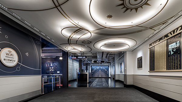
The need to capture attention on many levels begins the moment a visitor walks in the door or crosses the threshold into an exhibit space. Hennes and the Thinc Design team have been revamping one of the grandest entrances in the world, that of the Empire State Building in New York City. Attracting some four million visitors to its observation deck annually, the attraction previously struggled with crowds and congestion in its narrow lobby entrance. Now there is a vastly expanded 18,000-square-foot entry experience that combines storytelling and spectacle to enrich and entertain visitors from the moment they arrive.
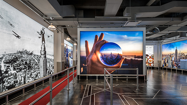 The experience goal was to capture that majestic, aspirational feeling that draws people to the Empire State Building from all over the world, and “make it feel like the moment you walk in the door you’re embraced by environment,” Hennes says. This is achieved with the provision of plenty of conversation starters, lots of historical information and interactives that share the history of the iconic building, with a particular focus on the stories of the people who visit and work on its famous outdoor observation deck.
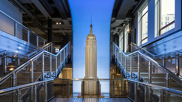
The new entrance also includes the ultimate selfie moment, a towering model of the Empire State Building surrounded by a grand staircase. But Hennes has observed that rather than this being a selfie-only zone, it’s turned into a place for energized human interaction: “I would say the vast majority of people are not taking selfies, they are giving their camera to someone else and engaging. There’s this wonderful exchange that’s happening there. That’s the kind of thing that can get missed in delivering the message and informational content. It’s about bringing people moments of joy.
All the Museum’s A Stage
David Bowie Is, Victoria & Albert Museum
Photo Credit: Stephen Cummiskey
Museums are definitely unique in that they have to capture the imagination of a vast and diverse audience, and do so on a level that creates a memorable connection. So, it’s no surprise that institutions are working with new types of design experts to create spotlight-worthy experiences.
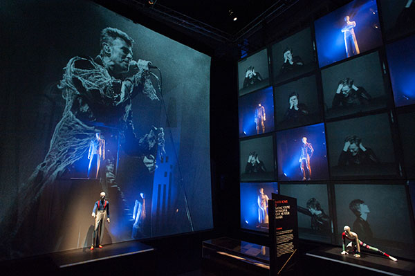
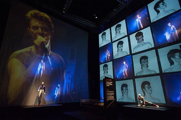
When 59 Productions was commissioned by the Victoria & Albert Museum to develop the sensationally successful David Bowie Is exhibition, which premiered in London back in 2013 and is still dazzling sellout crowds at museums around the world, the firm was better known for its theatrical production chops. But that was precisely the expertise required, recalls 59 Productions Company Director Lysander Ashton. The institution wanted “to bring that theatrical sensibility to the design. David Bowie was obviously very theatrical and brought that into his live performances. So, the idea was to create something that would feel in part like an event, like a show, right from the beginning.”
Of course, the request to bring a live music feeling to a museum was inherently paradoxical, Ashton notes, and of course a bit risky. “You might lose that sense of performance, where there’s something happening,” he says, when it’s placed in the middle of “a museum experience about dead things that had happened in the past.”
But the designers pressed on, and with the support of exhibit sponsor Sennheiser, very much created a real concert feeling in the final gallery of the exhibit. It worked out well, with the sound of the live show drawing visitors from the various other spaces to gather and watch the “show” when it’s cued every half hour.
Made in Space, Tycho Brahe Planetarium
Photo Credit: Kirstine Mengel
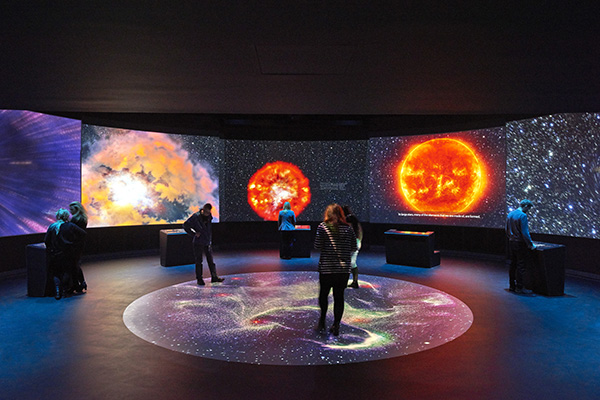
That sense of doing a live show as part of the exhibition is something 59 Productions has gone on to do in other museum exhibit designs. Notably, the Made in Space exhibit at the Tycho Brahe Planetarium in Copenhagen, Denmark, which was designed with the intention of enlivening the guest experience outside the main attraction of the attraction’s domed projection theater.
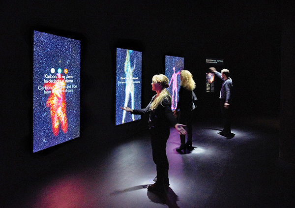
The Made in Space show moment occurs in a large circular exhibit space. In normal, non-show-moment mode, the room features several smaller projection areas with video pieces designed to create a connection between visitors’ own physical makeup and the elements and principles of astrophysics and space. Then, every 20 minutes, the exhibit is programmed to take over the whole space with a somewhat literal big bang: “We tell the whole story of the formation of the universe,14 billion years compressed into 90 seconds,” Ashton says.
Made in Space, Tycho Brahe Planetarium
Photo Credit: Kirstine Mengel
The show is absolutely about spectacle and creating a feeling of awe, Ashton explains, but it’s important to create a balance between “the communal, shared experience and individual learning experiences.” This meant the creation of a variety of experiences to accommodate various collective and individual learning styles. “We really wanted to make it engaging for everyone,” he explains, going beyond the typical science museum audience of younger people and into all age groups. It seems to have worked, he notes: “They’re getting very good audience response, both in terms of children and educational groups, as well as older demographics.”
Interactive Gets a Voice
Delivering moments of awe and education to a wide variety of audiences is dependent not only upon audiovisual spectacle, but even more critically, the interactive interface through which the experience is attained. Ideally, this is as seamless a transaction as possible, so as not to get in the way of absorbing content or feeling a sense of wonder.
Interaction in the museum environment is unique again in its need to have broad appeal and accessibility. Add to that the need to provide a renewed level of engagement in a multitude of areas and exhibits within a facility, and you have a serious design challenge. “If you just have touch everywhere, that one-dimensionality will cause you to lose context of information and people’s attention very quickly,” observes Sundar Raman, Director of Creative Engineering, with Local Projects.
Raman and the Local Projects team have considered interactivity on many levels across projects that include the 9/11 Memorial Museum, the City Museum of New York, and The Legacy Museum.
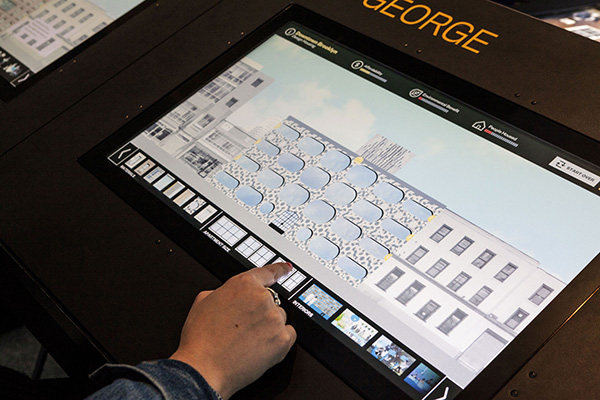
Interactive exhibit designed by Local Projects
for the Museum of the City of New York Future Lab
On a micro level, he speaks of creating the sensorially appropriate pen-stroke to a natural interaction that wouldn’t detract from the moment when visitors digitally inscribe their messages on the Last Column in the Foundation Hall at the National September 11 Memorial Museum.
“We were looking for a skeuomorphic experience, where you’re interacting with glass but it has to feel like paper,” he explains, referring to the design concept of bringing a real-world object sensibility to another representation, in this case digital. “How do you create friction on glass so that it feels like working with another medium? Where the pens started, some had a good flow with a certain friction, others were too slippery. That slipperiness is not good, even though it’s actually perfection of that technology.”
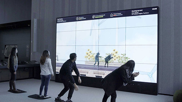
Interactive elements designed by Local Projects for
the Museum of the City of New York Future Lab
Giving these types of digital interactions a certain weight with respect to the gravitas of artifacts and content in museums is a significant challenge for designers. Touch design, for example, sometimes has to accommodate for more contemplation associated with the gravity of exhibit content, rather than producing the instant gratification one might require in a digital wayfinding application. Raman recalls how they used a “gradient swipe” for an exhibit at the Museum of the City of New York, which had some acceleration to it, so visitors felt like they were prompting something to happen, rather than just watching something spontaneously open on a screen.
On top of all this is the question of how to indicate to visitors which surfaces are reactive and which are not, and when to use the technology option or not. “You don’t want to have interactive everywhere,” Raman says. “Some artifacts you want to show a certain way, others you want to invite people in and let them fall into the interaction much more.”
While these problems are still being sussed out in the domain of touch, Raman adds that the advent of voice interaction will present similar conundrums (and more). Already, Local Projects is working on museum projects that will utilize speech recognition, “so we’re looking at what happens when spaces are speech reactive,” he adds. “The same friction we put in for touch, we have to use for speech as well.”
In the case of voice, an instant reaction can create an uncomfortable experience. You need to create a natural pause, like in normal speech patterns. “You don’t want to create the sensation that they’re listening to you all the time, so you don’t want it to respond right away,” he notes. “Think about it from restaurant perspective. If you could get instantaneous reaction from waiters, you’d be uncomfortable: ‘Why are they listening to me all the time?’” Soon the whole building will become the interface, of course. And then how will visitors feel?
This will provide a new level of exhibit personalization, suggests Maria Lorena Lehman, Founder of MLL Design Lab, where the goal of catering to different learning styles will be even more easily attained. We have some progress to make with adaptive sensory technologies first, she notes: “For this to be fully realized, the environment must change and adapt in real-time as it ‘tunes’ to the needs and goals of each museum visitor.
Lehman is developing a concept design project called EchoGlass, which incorporates wearable devices to help the museum tune to visitors. “This would take museum design from being a personalized interface to which a visitor must adjust, to being a personalized interface which adjusts with the visitor — even as their needs and goals change over time, and even before, during, and/or after their museum visit,” she says.
In her vision for the future, “wayfinding can tune to an individual’s real-time needs and goals, and museum non-exhibit spaces can be created to help visitors process what they have just experienced, if they become over-stimulated. Or can guide them toward greater inspiration, if they become under-stimulated.”
If that sounds pretty personal, Lehman asserts that it will be important to be extra thoughtful when adding adaptive sensory design into the museum innovation process: “This will unlock new opportunities to create extraordinary museum experiences into the future. Creativity is key.”


