Nestlé North American HQ – Arlington, Virginia

In his own words, Float4 founder Alex Simionescu describes how his company created six floors of interactive digital installations at Nestlé’s North American headquarters in Arlington, Virginia.
The Brief
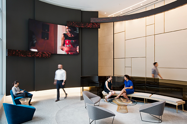
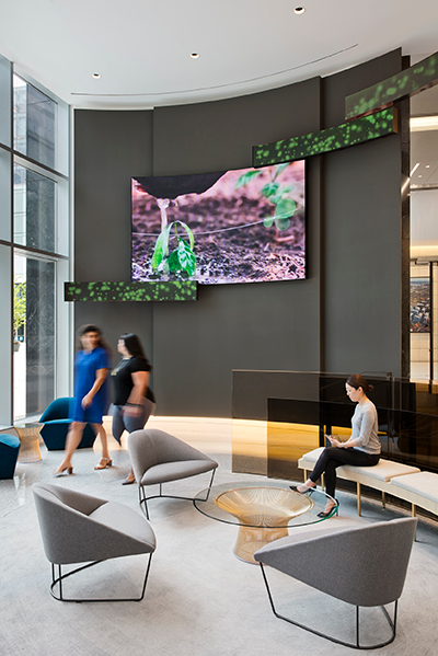
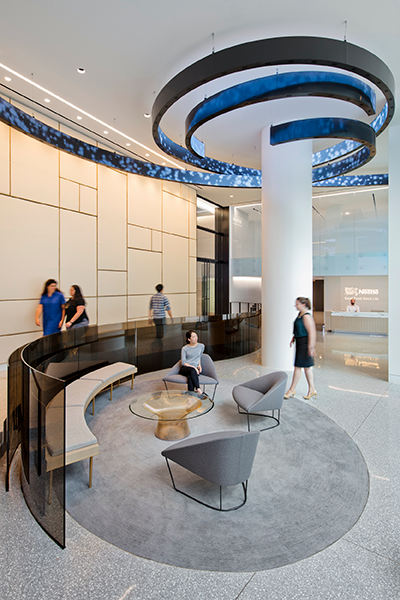
The architecture firm, Gensler, was in charge of doing all the interior design of the offices for Nestlé. One of the things they wanted to add was a digital experience. When we work with architects, we ask them to think of digital media as a material they’re adding to the space. There were to be six floors of screens showing content that is artistic renderings of visuals that evoke elements that relate to Nestlé products and brands.
The first thing we did was look at content strategy; what are we trying to communicate, and to whom? We then considered concept development, design, and finally, production. Based on those early meetings, we landed on informative content, corporate communication, and artistic pieces that would evoke the message we wanted to portray. The digital installations were to be an extension of the brand experience that the office provides.
The Challenge
One of the main challenges was not showing everything. Once you start to look at a brand like Nestlé, there’s so much you can talk about, but we were trying to create something that was not about a product catalog. We asked ourselves questions like ‘what are some of the little things we want people to remember? How do we not turn things into an extension of a marketing campaign?’ When it’s meant to be artistic, it’s not meant to be understood — it’s about generating a reaction. One of the main challenges was to create a conversation piece; we wanted to present something that is not meant to be rational and is aesthetically satisfying. Our hope was that everyone would like it, but we understood that everybody would have different degrees of appreciation. The worst case was someone not caring at all, or not noticing.
Another, albeit more physical, challenge was that it was not a new building, it was a retrofit. So, where we were working on the six floors, you never knew quite what you were going to find in the ceiling until you got there. There’d be an air duct right where you’re supposed to put a sensor, or internet wasn’t available, or some connections weren’t terminated correctly. A lot of these issues came about during reconstruction; when we showed up, the building was almost finished so there weren’t too many problems.
The Work
We designed a variety of content capsules that we felt reflected the different requirements we had distilled through content strategy. As we received approval from the client, we would commence production. And finally, delivery meant we went on site and installed interactive sensors and the hardware component that powered the displays.
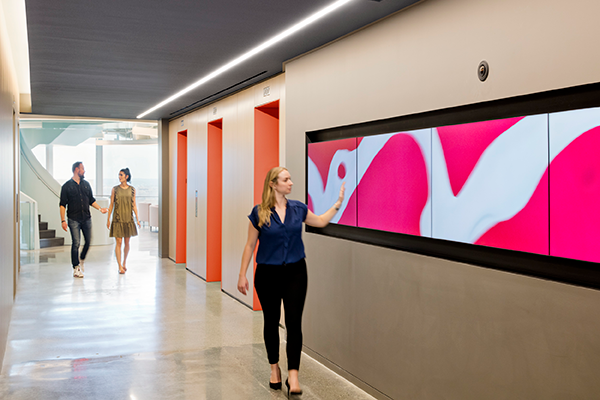
On each of the six floors the same screen layout is repeated, but the content is different. Taking Nestlé products as a jumping-off point, we realized quickly just how many products actually come from Nestlé. We subdivided them into categories, such as liquids, fruits, or effects, such as glass distortions. The idea was not to recognize products, but to make artistic pieces. So, you see fluids slowly moving at high resolution and they react to the movement, like when you pour milk into cold brew coffee and the milk produces slowly changing patterns, like a moving sculpture. We also had more playful pieces using ingredients found in their products. There is one about berries, where you see fruits float slowly and they react to your interaction when you pass in front of it. To achieve that, we created an invisible curtain that’s a foot away from the screen, which reacts to hand movements. Instinctively people will walk toward the screen, and where your hand hits the invisible curtain, it pushes particles away and brings them back together.
With the fluids we applied the same principle with a laser curtain that detected two types of interactions, pushing away and attracting the fluids. So, with the secondary interaction you’re adding the fluid to the simulation: milk to the coffee. It’s not meant to be something people play around with for very long, but more of a talking piece, for example, when they have visitors coming to the office.
We also created content directed at corporate communications. With some screens there is the ability to update content with popups that can be used to convey information about the company, or create a sense of community between people in the offices and workers around the world; tidbits like the weather in Switzerland or headline news in that country, or the pictures of farmers that provide the coffee they make.
The Goal
One of our goals was to create a balance between something that’s engaging but not distracting. The fact that it’s interactive does help a lot with engagement, and also helpful is that it’s real-time content that never loops. But we had to keep in mind that it’s an office, and if someone is running late, they might not stop and interact.
Another goal was to make it client-manageable. We created different degrees of production complexities. The ones that use simulations are one-off pieces, but the content capsules are easy to update, and we provided the client with a tool that allows them to update content regularly to keep things fresh. Therefore, in much the same way as one might approach a website, the client has the ability to update it as often as they like without having to rely on a programmer.
The Successes
The first time I saw it in person was great. I usually see the project start when most of it exists only on paper, and then halfway through and some of the bigger milestones, but when I saw it in person, seeing the concept to execution, it was even better than I imagined.
From a relationship standpoint, I measure success by whether the client wants to continue to do business with us. Regardless of if they spent $50K or $5 million, if they feel it’s money well spent, they’ll do it again. In this instance, one of the things I was really happy about was they asked us to do an additional floor.
When I think about where we started and our ability to work with these brands and collaborate with architects as distinguished as Gensler, I’m happy and proud that we were able to provide the service that they were counting on and that they trusted us to bring their vision to reality. Our creative, production, and technical teams were able to do that, and I’m extremely proud.
It’s still fresh, so we are keeping in touch with the client and seeing how they’re appropriating the tool themselves and making the best of their investment.
Click on the images below to view them full-size.
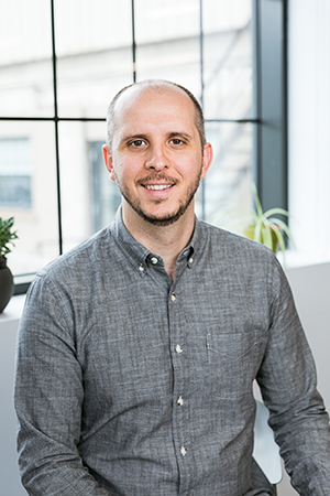 Alex Simionescu, Founder, Float4
About Alex Simionescu
Before founding Float4, perhaps best described as an interactive multimedia digital design studio, Alex Simionescu studied computer engineering and spent two years working as a software developer in video game studio. During that time, he began to envisage the potential of responsive multimedia environments for other industries, such as AV.
Since its launch in 2008, Float4 has focused on creating digital experiences in physical spaces “to amplify their identity.”
“We saw many parallels with the world of video games and the world of interactive installations,” says Simionescu — in particular, he notes, within the realm of real-time technology. “It’s that notion of interaction, where you’re part of the experience.”
The studio produces content for mainly large-scale installations, with content driven by data and interactive or human elements, in the areas of architecture, themed entertainment, live entertainment, and marketing activations.
“I’m somewhat of a nerd who loves creative challenges, and I love to see what technology can achieve in the four segments we work across. They each have different technologies available, with which you can do so much,” he says. “Technology can seem intimidating, but I love to delve deep into how it works and how it further enables creativity.”
In 2011, the company expanded from its Montreal base with the addition of an office in New York City. It recently added a second company, RealMotion, which markets a technology the company developed for AV professionals and integrators that allows installations of any type of digital media display to become interactive high-resolution environments. RealMotion was launched at InfoComm 2017.
Recent large-scale installations include a 35 x 25 foot display in the lobby of Liberty 28 tower in downtown Manhattan, a series of six short films in collaboration with LG for the Bloomingdale’s department store, interactive content production for the Statue of Liberty Museum, in collaboration with ESI Design and architecture firm FXCollaborative, and six floors of interactive installations for the new Nestlé HQ in Arlington, Virginia, in collaboration with Gensler DC.


